1) Goals & common use cases
- Drive users from physical surfaces to digital: menus, product pages, coupons, apps.
- Enable traceable campaigns with UTM parameters.
- Provide persistent info where text would be long (Wi‑Fi credentials, manuals).
2) Size vs. viewing distance
Use the 1/10 rule: QR side ≥ distance/10. Increase to 1/8 in low light or moving crowds. Minimum physical size rarely below 2 cm even at close range.
| Distance | Recommended side | Context |
|---|---|---|
| 0.5 m | ≥ 5–7 cm | Packaging, table tents |
| 1–2 m | ≥ 10–25 cm | Posters at eye level |
| 3–5 m | ≥ 30–60 cm | Large signage, corridors |
3) ECC levels (L/M/Q/H)
- L (7%): only for pristine, close‑range scans.
- M (15%): good default for print.
- Q (25%): better tolerance to glare/occlusion.
- H (30%): for logos in the center or harsh outdoor conditions.
4) Contrast, colors and materials
- Dark modules on light background, matte finish. Avoid glossy reflections.
- Respect the quiet zone (≥ 4 modules) around the code.
- Colored codes: ensure luminance contrast similar to WCAG AA.
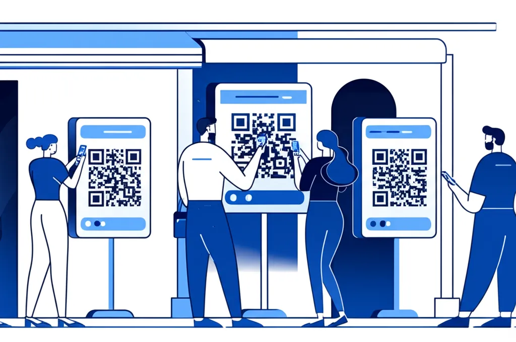
5) Placement and CTA
- Eye‑level or slightly below, not higher than 1.6 m for handheld scan.
- Keep stable surfaces; avoid moving doors unless very large.
- Add a short clear CTA: “Scan to order”, “Scan for menu”.
6) Dynamic vs. static QR
Dynamic lets you change targets and add analytics. Static is robust for offline content. For campaigns, use dynamic with short branded URLs plus UTM.
7) Tracking & privacy
- Add UTM parameters to the target URL to attribute traffic in analytics.
- Consider privacy laws for personal data collection beyond the scan.
8) Design with logo & frames
- Use H ECC if placing a logo in the center. Keep finder patterns untouched.
- Frames help instructions and brand consistency (“Scan me”).
9) Print & export checklist
- Export as SVG or high‑res PNG for print (≥ 300 DPI at final size).
- Test prints at scale under real lighting and distance.
- Verify multiple devices (iOS/Android) and camera apps.
10) With Orqui QR
- Open the QR generator.
- Pick ECC M or H, set side and margin, choose solid color or gradient.
- Optional logo with rounded corners; keep quiet zone intact.
- Export PNG/SVG/PDF and place on your artwork.